Monday, January 30, 2017

Best of the Best on the SAG Red Carpet

I skipped the Golden Globes red carpet earlier this month because I was sick with the flu and slept through most of it. Last night my sister and I watched the Screen Actors Guild red carpet coverage and awards ceremony throughout which we offered our professional fashion critique.

I'm not going to point out the several candidates for worst dressed (they know who they are), although I'm sorry, Nicole Kidman really should have thought twice about that shimmering green double parrot Gucci number. I want to highlight just the best of the evening, so let me cut right to the chase:

Emily Blunt in Roberto Cavalli
Love it both coming & going.
The beading, the colour, the fit...c'est parfait!

Image via Grazia Daily


Yara Shahidi in Naeem Khan
This girl has an bold sense of fashion and I like it!!
This colourful dress turns heads in a sea of safe gowns.

Image via TeenVogue.com

Gina Rodriguez in PatBo
More beading and a dash of colour, I sense a theme here.
Simple & chic.

 Image via People.com

"Best Black Dress" goes to Amy Adams in Brandon Maxwell

Image via Grazia Daily

 "Best White Dress" goes to Viola Davis in Vivienne Westwood

Image via PopSugar.com

Best Dressed Man
Ryan Gosling, naturally, wearing Gucci

 Image via PopSugar.com
Just Some Stuff I Finally Did


I'm sure many of you understand the never ending to-do list that quite literally never ends simply because you never seem to get to the 'do' part. I've just passed four years of living in the "new" condo and there are several things that I've only just managed to cross off the list. Mind you, design is a process, and things have to happen in a certain order, and sometimes those things just take time.

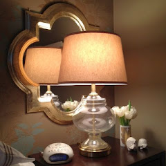
Case in point: Shortly after I moved into my condo I created a gallery wall at the end of the front hall next to the built in study nook (see the finished product in this post). When I painted the wall a dark navy blue two years later, I took most of the artwork down and hung just four gold framed paintings. My intention was to recreate the gallery wall in the master bedroom. The plan was to hang the photos above a marble top commode (which I had yet to purchase) and also to incorporate a small bedroom television. It was nine months before I would find the right Louis XVI chest of drawers (see this post) and another 15 months before I wall mounted the tv and hung the photographs to recreate the gallery wall.

Et voila!


Of course I'm still not 100% done. I'd like to replace the Toronto photos in the center triptych with three new photos, but there's no rush, I'll get around to it eventually. If you're really paying attention, you'll notice that I went the extra mile and added a paintable cord cover to camouflage the ugly television wires.

Since I was on a roll, I also took the time to add a custom touch to the Pax drawers I had installed in the master bedroom closet four years ago (here is the original post). This past fall, while looking for cabinet hardware for a client, I fell hard for these Martha Stewart brass bin pulls. I ordered them up and they've been sitting in an envelope for months just waiting to be installed. I was nervous to do the installation on my own because the job required  precision - the pulls all needed to be perfectly aligned and level. Turns out it wasn't nearly as difficult as I thought it would be, it took less than an hour, and the pulls added the custom look I was hoping for.


It's always nice to get things done around the house. The to-do list dwindles and there's a real sense of satisfaction that comes with a job well done. Onward & upward.

Tuesday, March 29, 2016

What's Up Next...

Every time I finish working on a design project, there is a small sense of relief that it's complete (and looks great, of course), but an even stronger sense of disappointment that the fun is over. Within days I start to feel restless. What's next? I always want something on my plate, even if I say that I don't.

As luck would have it, the basement renovation wrapped up (the carpet was finally installed last week) just as spring begins. It's time to start thinking about summer and the time we'll spend away from home working at our seasonal retail stores (if you're new here, my day job is as buyer/merchandiser/supervisor for an independent fashion retailer). The lease was recently signed for a lengthy commitment at our Grand Bend location, so I've decided that we should make our apartment there feel more comfortable. With a budget of approximately zero dollars, I've been spending a lot of time on Kijiji and my favourite auction websites trying to come up with a design vision.

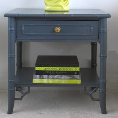
I've started to cobble together the basics for our little two bedroom place. It might not be perfect, but it's a start and we can build on it each year. Last fall I found a pair of somewhat worn and slighting damaged wood nesting tables at Value Village for $6. A bit of glue, a quick steel wool sanding and a dose of Restor-a-Finish was all they needed to look super fabulous. We already have a round dining table with four chairs; the table is going to get a makeover (paint!) soon, but I don't know what I'm going to do with the chairs they're kinda country/ugly/totally not my style... Recently I picked up a pair of upholstered tub chairs for $60 on Kijiji. They're really comfortable and they swivel and rock which is super cool, but they're a dark plaid which definitely won't work with the rest of my ideas for the space. I may have the chairs reupholstered eventually and keep them for my own home but in the mean time we have no choice but to live with the plaid. What else? First and foremost, the walls of the entire apartment will get a fresh coat of white paint. I don't even remember what colour they are currently, but I know I don't like it...I'm thinking maybe it's flesh tone. (Do they even make paint in flesh tone? Because they shouldn't.) The one item I've purchased in a retail store is an amazing aerial beach photograph from Homesense. Featuring the vivid teal of ocean waters, it will provide a nice punch of colour in the dining area. I'm itching to get started, but I need to wait for the weather to warm up before I can start to clean and paint.

The real point of this post is that I want to tell you all about my most recent auction win!! I scored a pair of twin spindle bed frames online at MaxSold  which will be perfect in one of the bedrooms to maximize sleeping space. There will be times when four adults will need space to sleep in this apartment, and everyone will require their own bed. With fresh white walls, I have the opportunity to paint the bed frames any colour I want, so the big question is, what colour should I choose? I have visions of glossy red or navy or green or coral or teal or grey. It all depends on what kind of tone I want to set for this room...the bright colours are fun, but the more subtle colours are restful.


I realize that these beds are "antique", but these aren't particularly valuable and refinishing sounds like a lot of work to me. Although some people hate to paint wood, I'm all for it; a coat of paint will give these beds a modern touch. My heart tells me that a coat of navy blue or kelly green would be lovely, but my head tells me that I should choose a neutral and restful dove grey. I have a few examples of painted spindle beds that I've found online. Tell me what you think...


Update: Since writing the above paragraphs, I purchased the most amazing rug at Empire Auctions (SUCH a good deal!!), and my train of thought is that I should select the colour scheme for the apartment based on colours in the rug, focusing on two main colours with white as backdrop. I know that teal is one of those colours so I just need to pull a secondary colour from the rug...I'm thinking coral...

Monday, March 7, 2016

A Brand New Space: Grey & White Basement Renovation


I posted briefly about the basement renovation I was working on at the end of January. This was a quick renovation, turning an unfinished basement into a modern living space in just under 5 weeks from start to finish. (There was just one hitch - the carpet for the living area wasn't installed due to a shipping delay, but the kitchenette and bathroom have been completed.) We worked with a great contractor which made our job easy, as long as we were ready with final decisions and materials when required. Knowing that we wanted a grey and white colour scheme right out of the gate helped drive most of the decisions regarding paint colours, flooring, counter tops, back splash tiles, hardware and fixtures.


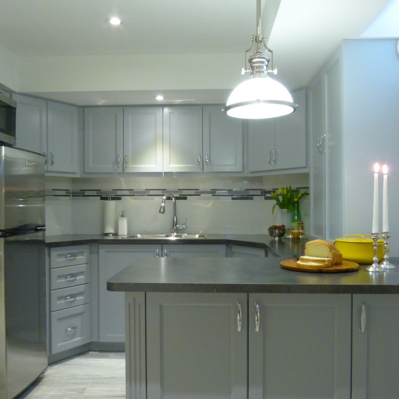
Everything happens in a particular order, and if my memory serves me correctly, we started with selection of the floor tiles. We chose a 12"x24" semi-polished grey techmarble porcelain stone from Olympia Tile. From this we were able pull the paint colours for the cabinetry, pulling Silver Half Dollar and Pewter from the Benjamin Moore paint deck, using the lighter shade on the top cabinetry and the slightly darker shade on the bottom. This paint trick is subtle, but it gives just a bit more weight to the bottom cabinets. You may have noticed that we added doors to the peninsula cabinets from the opposite side which allows easy access to serving pieces, cutlery, and napkins.


We could have gone with a light colour for the counter tops which would be very on trend, but knowing that we wanted to use a white subway tile back splash with a mosaic tile band, it felt more practical to go with a dark shade. We chose Wilsonart's black alicante counter top - yes, it's a laminate - natural stone was not in the homeowner's budget, and we are really pleased with how great the laminate looks. We added a bit of interest to the neutral white subway tile back splash with an accent band of marble and glass mosaic tiles.


I hope by now you've spotted the gorgeous Cosmas hardware that we chose for the cabinet pulls. I felt very strongly about using polished chrome rather than brushed because this element adds a touch of sparkle to the kitchenette. It's easy to forget that this is a basement because it's actually quite bright - the nearby window certainly helps, as do any reflective elements in the space. We kept the finishes consistent, choosing a polished chrome American Standard goose neck faucet, and a polished chrome ELK Lighting pendant over the peninsula. 


We used a lot of the same finishes in the new washroom to keep the flow consistent throughout the basement. It was tricky getting shots of the washroom since it's a small space, but it certainly has all of the fundamentals. We continued with the same floor tile and paint colours, but added a few new elements to keep it interesting.


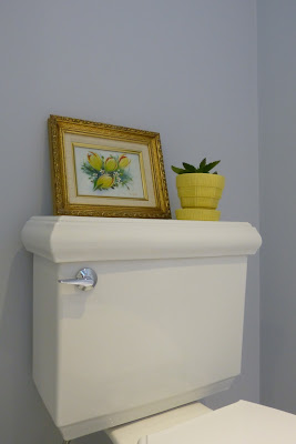
Can we just talk about that toilet for a minute? It's the Memoirs classic design from Kohler and it's a bit odd how much I love it; it has such beautiful architectural detail at the bottom as well as on the tank lid. It's just a bonus that it's very well reviewed. The clean & simple white trash bin cleverly disguises the water line running from the wall to the tank.


With space contraints in this washroom, it made sense to build the vanity area into a nook beside the shower. We opted for some new elements in this area, including a Caesarstone counter top with undermount sink. This would have been a big splurge in the kitchen, but with just a small area to cover in the washroom, it wasn't a total budget buster.


I really pushed for the Moen Boardwalk faucet, I think it's a real stunner and I love the way it bridges both traditional & contemporary design. The modern square lines of the faucet make it the right choice to harmonize with the square sink. We repeated the square motif throughout this small space, from the faucet to the hardware to the soap dish to the trash bin. Good design isn't an accident ;)
 

This washroom features polished chrome jewels in the faucet, towel bar, cabinet hardware and light fixture. Even the mirror reflects as much light as possible with its mirrored frame. We opted to hang our own mirror (found at Homesense); it didn't cost us anything extra and looks so much better than a builder basic. Don't be afraid to ask your contractor about details like this, it can make a world of difference!! 


We took our cue from the kitchen back splash when deciding on tile for the shower walls, only this time we chose a larger scale. It was important to the home owner that the shower be low maintenance (of couse!), so ease of care was an important consideration. We opted for an 8"x20" bright arctic white tile from Olympia which gave us the fresh, clean, modern look of subway tile without all of the grout. The accent tile is the same glass & marble mosaic used for the kitchen back splash, only here we used a wider band to match the scale of the white tiles.


This was the first major project I've taken on that wasn't strictly decorating, and I really enjoyed the experience. It was fun assembling all of the parts together and then seeing the ideas come to life. There were a lot of decisions to be made, and to keep the ball rolling it was important to make those choices quickly and confidently. We made just one misstep (a light fixture that didn't suit the space and was promptly returned), but by and large we were very happy with our choices and consequently we are thrilled with the final results. Let the entertaining begin!!